
One AI Prompt That Designs Every Social Media Poster You Need
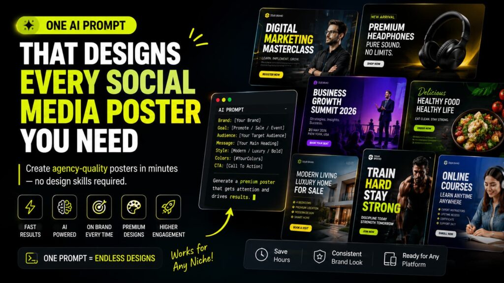
Meta description: A single reusable prompt that turns any AI image tool into your personal design studio. Copy it, fill in your brand details, and get posters that look ready for Instagram, LinkedIn, or print.
Designing a poster used to mean opening Canva, staring at a blank template, and giving up after twenty minutes of dragging shapes around. Then it meant hiring a designer, waiting two days, and paying for a single graphic that might not even fit the brand right. There is a faster route now, and it comes down to one well built prompt you can reuse for every single poster your business ever needs.
Below is the full prompt, a breakdown of what each section controls, and a step by step guide on how to fill it in so the output looks like something a real agency charged thousands for.
The Prompt
Copy everything below, paste it into your AI image tool of choice, and replace anything in brackets with your own details.
Act as a world class Creative Director, Senior Graphic Designer, Brand Strategist, Art Director, Typography Expert, Advertising Designer, and Visual Storytelling Specialist with 25+ years of experience working for Apple, Nike, Adidas, Coca Cola, Netflix, Tesla, Airbnb, Google, and Pentagram.

Your task is to create a premium, modern, highly engaging social media poster that looks professionally designed by an award winning agency.

PROJECT INFORMATION

Poster Type:
[Instagram Post / Story / Facebook / LinkedIn / Flyer / Banner / Event Poster / Advertisement / Offer Poster / Product Poster / Real Estate / Educational / Healthcare / Restaurant / Fashion / Technology / Corporate]

Brand Name:
[Brand Name]

Industry:
[Business Type]

Poster Goal:
[Promote Product / Generate Leads / Event / Awareness / Offer / Sale / Announcement / Launch]

Target Audience:
[Students / Parents / Professionals / Entrepreneurs / Women / Men / Families / etc.]

Brand Personality:
[Luxury / Premium / Modern / Minimal / Bold / Elegant / Corporate / Friendly / Youthful / Creative]

Primary Message:
[Main Heading]

Supporting Text:
[Small Description]

Call To Action:
[Call Now / Book Today / Register Now / Learn More / Shop Now / Visit Website / Enquire Now]

VISUAL STYLE

Design Style:
[Minimal / Luxury / Futuristic / Glassmorphism / Editorial / Clean / Corporate / Premium / Vibrant / Bold / Modern]

Mood:
[Professional / Exciting / Elegant / Trustworthy / Premium / Energetic]

Color Palette:
[Brand Colors]

Background Style:
[Gradient / Abstract Shapes / Glass / Premium Texture / Dark / White / 3D / Minimal]

Lighting:
Soft studio lighting with realistic shadows and premium highlights.

Depth:
Create multiple visual layers for a premium composition.

TYPOGRAPHY

Use premium typography hierarchy.
Large bold headline
Medium supporting text
Small details
Strong CTA button

Ensure excellent readability. Use proper spacing. Maintain perfect alignment. Use professional font pairing.

LAYOUT

Use a premium grid layout. Apply excellent white space. Maintain strong visual hierarchy. Balance all elements.

Create eye movement from Headline to Visual to Benefits to CTA to Contact Details.

Everything should feel clean and uncluttered.

GRAPHIC ELEMENTS

Use only graphics relevant to the topic. Include modern icons, abstract premium shapes, soft gradients, glass effects if suitable, light particles if appropriate, realistic shadows, depth, and elegant overlays. Never overcrowd the design.

IMAGES

If a product image is provided: remove background perfectly, improve lighting, add realistic shadow, match scene lighting, make product premium, keep proportions accurate.

If no image is provided: generate a premium realistic visual matching the topic.

BRANDING

Include logo, brand colors, brand identity, website, phone, and social media icons if optional. Branding should feel subtle and premium.

MARKETING PSYCHOLOGY

Design should use visual hierarchy, contrast, focal point, premium spacing, trust, emotion, simplicity, and high conversion principles. Make users stop scrolling.

QUALITY

The final design must look like an Apple campaign, a Nike advertisement, a Tesla poster, a Netflix promotion, a Behance featured project, a Dribbble award winner, Awwwards quality, agency level commercial artwork.

TECHNICAL

Canvas:
[1080x1350 / 1080x1080 / 1920x1080 / A4]

Ultra high resolution. 8K quality. Perfect sharpness. Professional color grading. Commercial quality. Premium finish. No spelling mistakes. No unnecessary decorations. No clutter. Perfect alignment. Perfect margins. Perfect spacing.

FINAL OUTPUT

Generate one premium poster with outstanding composition, modern layout, beautiful typography, premium lighting, high end branding, realistic shadows, excellent readability, marketing focused design, luxury commercial finish, ready to publish on social media or print.
How to Use It Step by Step
Step one is picking your poster type. Are you making an Instagram post, a story, a flyer, or an event banner? This single choice changes the canvas size and layout logic, so fill it in first.
Step two is filling in your brand details. Type your actual brand name, your industry, and your poster’s goal. If the goal is a sale, say sale. If it is brand awareness, say that instead. The AI adjusts tone and urgency based on this.
Step three is describing your audience and brand personality. A poster aimed at busy parents should not look like one aimed at college students, and a luxury brand should never look like a bargain outlet. These two lines quietly reshape everything from color choice to spacing.
Step four is writing your actual message. Keep your headline short, your supporting line focused on one benefit, and your call to action direct. Phrases like Book Today or Shop Now work far better than long sentences.
Step five is choosing your visual style and colors. If you already have brand colors, list the exact hex codes. This keeps every poster you generate consistent, which matters a lot once you start publishing regularly.
Step six is uploading a product photo if you have one. The prompt already tells the tool to clean the background, fix lighting, and add a shadow so the photo blends naturally into the design instead of looking pasted on.
Step seven is picking your final canvas size, whether that is a square post, a story format, or a printable flyer, and then generating.
Why This Approach Beats Random Prompting
Most people asking an AI tool for a poster type something short and hope for the best. The result usually looks cluttered, has awkward spacing, or uses fonts that clash. This structured prompt solves that by copying how professional studios actually plan a layout: headline first, visual second, supporting benefits third, call to action fourth, and contact details last. That order matches how a human eye naturally scans a page, so the poster feels intentional rather than random.
It also stops common AI mistakes before they happen. Telling the tool explicitly to avoid clutter, keep spacing even, maintain alignment, and skip unnecessary decoration removes the guesswork that usually leads to busy, unreadable designs.
Tips for Getting the Best Results
Fill in every blank instead of leaving placeholders. The more specific you are about your brand and goal, the closer the output gets to something you could publish immediately.
Stick to one brand personality per poster. Mixing luxury and playful in the same brief confuses the tone and the AI will try to blend both, which rarely looks clean.
Keep your headline under six or seven words. Posters are read in seconds, not minutes, so shorter always performs better.
Reuse the exact same brand colors and fonts across every poster you generate with this prompt. That consistency is what makes a business look established instead of scattered.
Save your favorite version of the filled in prompt as a template. Once you find wording that consistently gives you strong results for your brand, keep reusing that exact wording and only swap out the message and image each time.
Common Mistakes to Avoid
Leaving the brand personality field blank is the biggest one. Without it, the AI defaults to a generic corporate look that could belong to any company.
Overloading the supporting text with multiple benefits at once also weakens the design. Pick one main benefit per poster and save the rest for another post.
Skipping the technical section is another mistake people make. Without a defined canvas size, you often get an image that needs to be cropped awkwardly before it fits your platform properly.
Final Thoughts
A poster is often the first thing a potential customer sees, so it carries more weight than people expect. This prompt turns poster creation into a repeatable process rather than a guessing game, which means your brand can look polished and consistent across every single post without needing a design team on standby. Fill it in with real details, keep your message tight, and let the structure do the heavy lifting.
Frequently Asked Questions
Can I use this prompt for print materials as well as social posts Yes. Changing the canvas size field to something like A4 shifts the layout logic toward print proportions instead of a square or vertical social format.
Do I need design experience to use this No. The prompt already contains professional design rules built into it, so you only need to supply your brand details and message.
Will every poster look different or repetitive As long as you vary the headline, supporting text, and imagery while keeping your brand colors consistent, each poster will feel fresh but still recognizably yours.
Can I use my own product photos Yes. The prompt includes instructions for cleaning up backgrounds, fixing lighting, and adding shadows so a real product photo blends into the design naturally.
More Resources
"Get Your Free Marketing Growth Consultation"
Let's Connect
Let’s talk! Whether you’re just starting out online or want to fix what’s not working, I’m here to help. As the best digital marketing strategist in Wayanad, I focus on what actually works for your business. Shoot me a message and we’ll figure out the best path forward.”